[PHOTOGRAPHY]
CLIENT
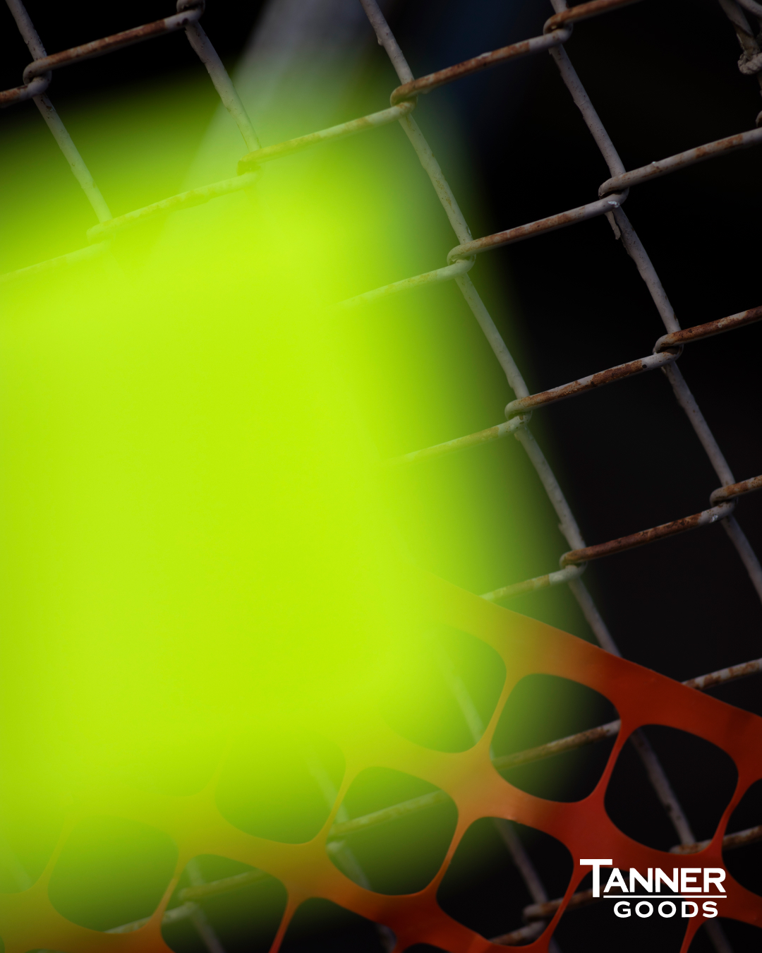
Tanner Goods
Photography & art direction for Portland-based shop that makes high quality basics leather goods, belts, wallets and accessories. Working with Mia Doerwald, we shot photographs of the Electric Remix wallets made with custom dyed electric skirting leather in unexpected locations with unexpected items, highlighting the new and unexpected color in their line of products.
CLIENT
Tanner Goods
Photography & art direction for Portland-based shop that makes high quality basics leather goods, belts, wallets and accessories. Working with Mia Doerwald, we shot photographs of the Electric Remix wallets made with custom dyed electric skirting leather in unexpected locations with unexpected items, highlighting the new and unexpected color in their line of products.


[ART DIRECTION]
PHOTOGRAPHER
Arthur Comely
Curated by Tate 24SS — the first UT collection with Tate Modern. Tate and UNIQLO have been in partnership since 2016, championing a shared belief that Art and Play are for everyone. Artworks from this collection were curated from Tate’s collection of artists that reflect the spirit of Play.


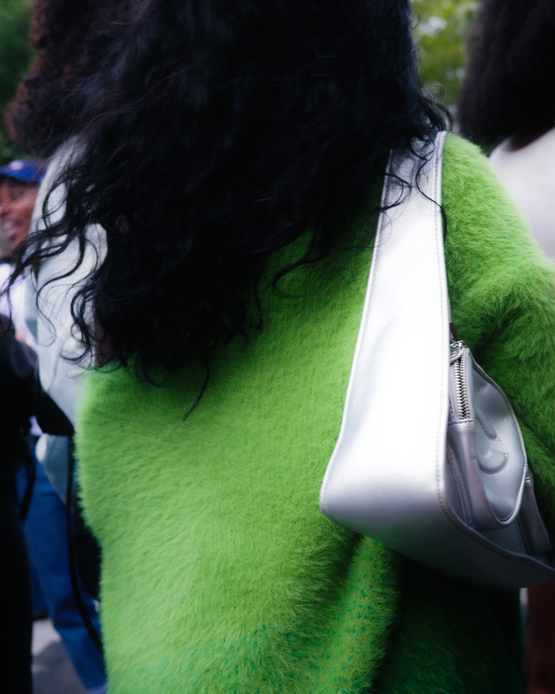
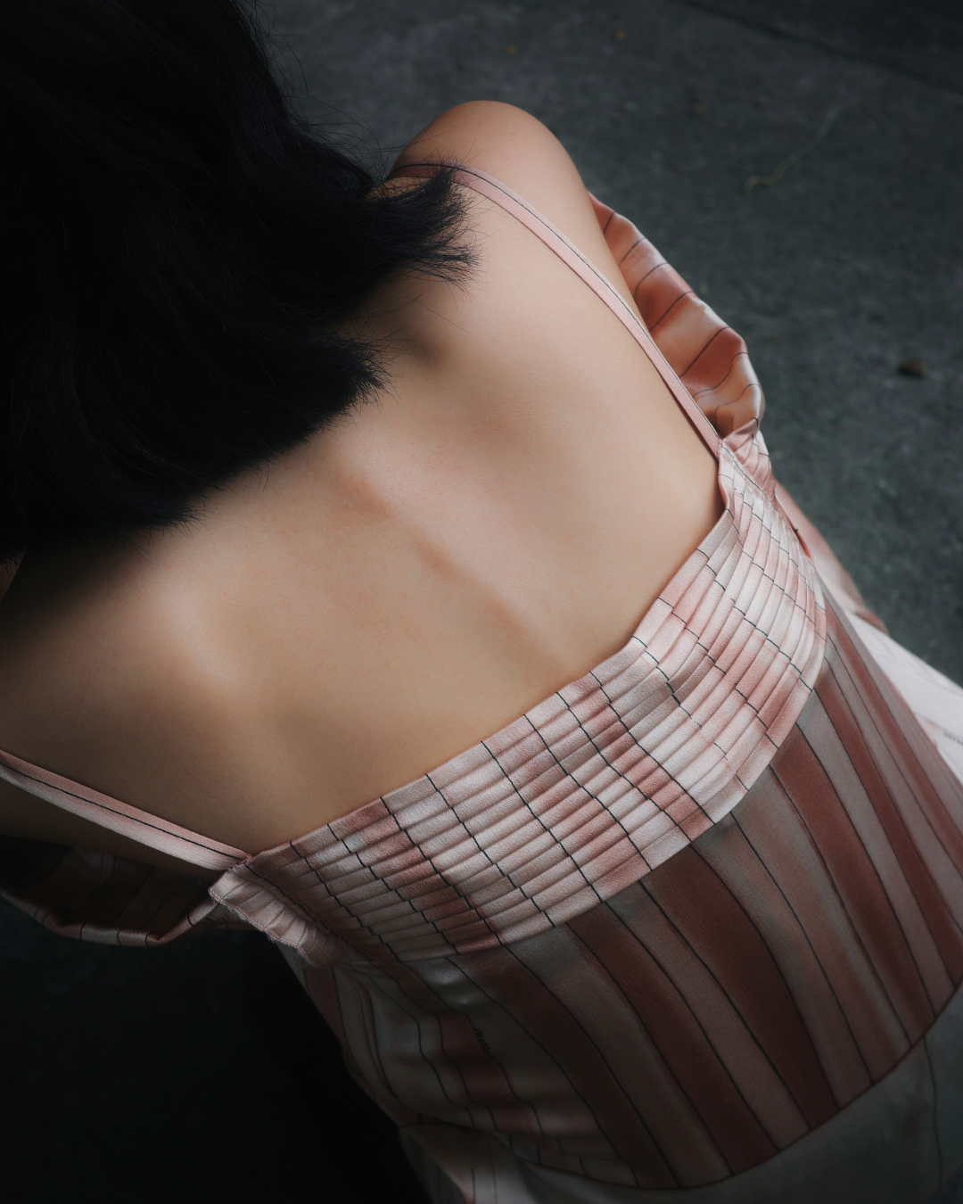
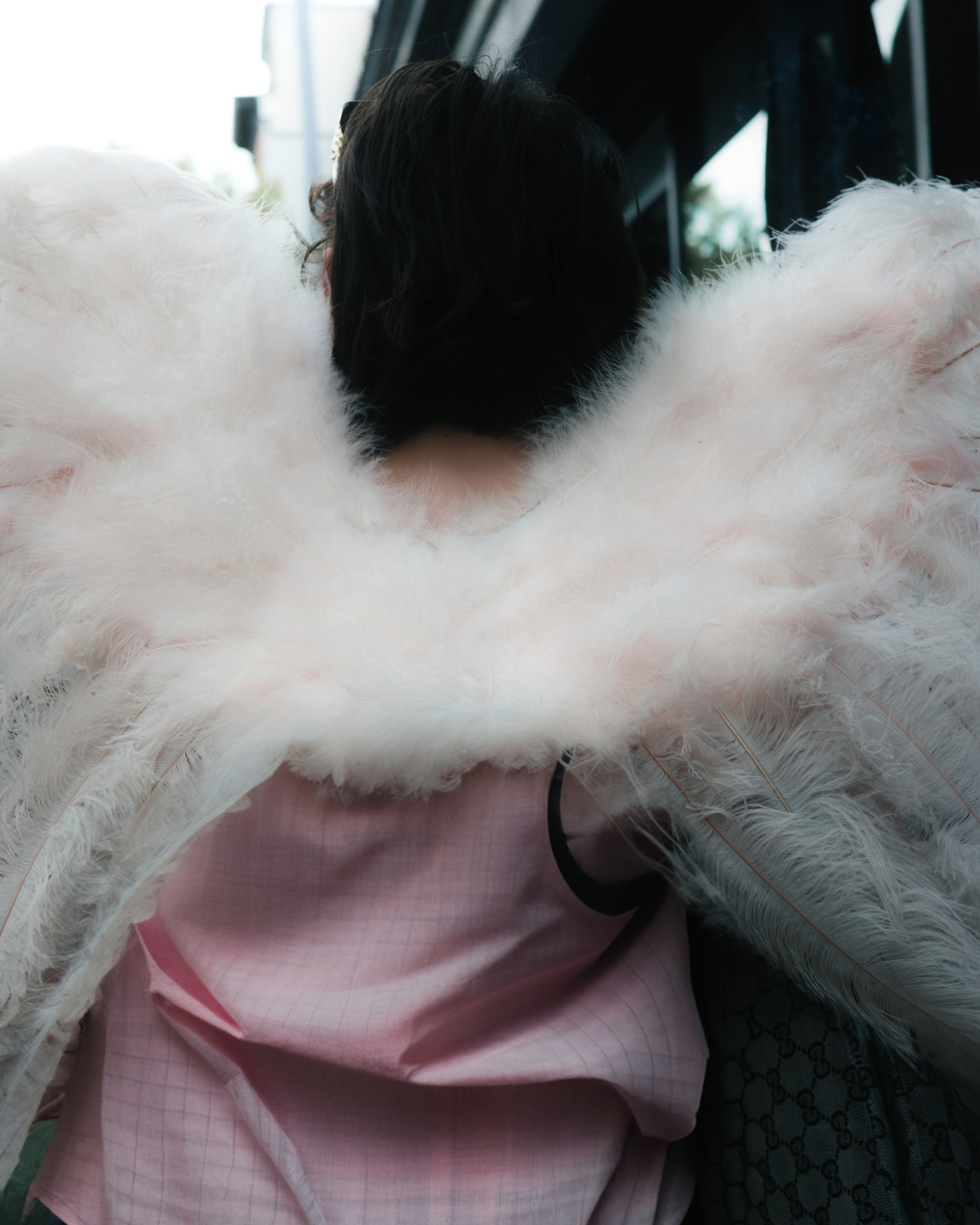
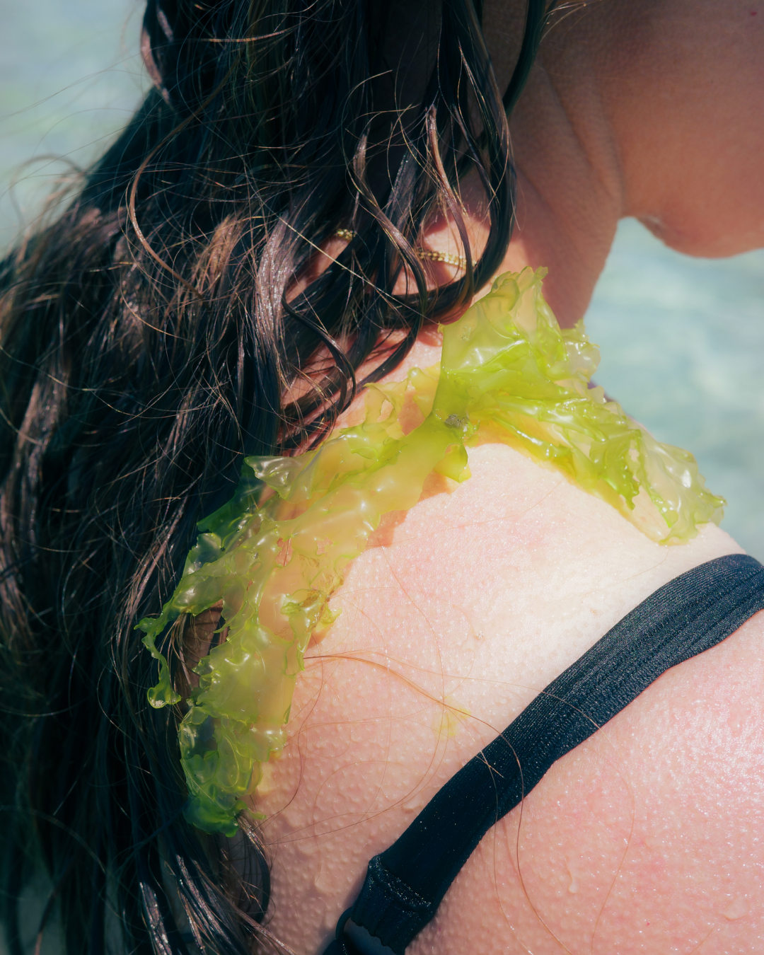
[PHOTOGRAPHY]
Photographing the backs of friends and strangers doing various things in their daily life. I wanted to capture the sense of vulnerability and beauty in doing mundane things.
Photographing the backs of friends and strangers doing various things in their daily life. I wanted to capture the sense of vulnerability and beauty in doing mundane things.


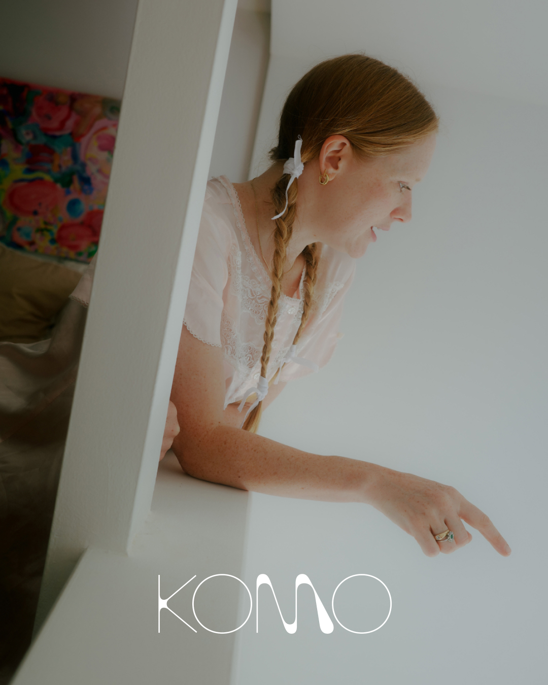
[BRANDING]
CLIENT
Komo Collective
Design and art direction for Komo Collective, an online marketplace for curated paintings, sculpture, and design. Komo was built with the goal of providing artists and makers a platform for their work to be seen.
CLIENT
Komo Collective
Design and art direction for Komo Collective, an online marketplace for curated paintings, sculpture, and design. Komo was built with the goal of providing artists and makers a platform for their work to be seen.


[PHOTOGRAPHY]
STYLIST
Christina Allen
Playing with food. A collaboration with food/prop stylist Christina Allen.
STYLIST
Christina Allen
Playing with food. A collaboration with food/prop stylist Christina Allen.


[PHOTOGRAPHY & STYLING]
CLIENT
Mise en Scènt
FOUNDER
Greer Temnick
Brooklyn based candle studio. Imagery featured on Fotografiska shop, Apartment Therapy, Buzzfeed, and many more.
CLIENT
Mise en Scènt
FOUNDER
Greer Temnick
Brooklyn based candle studio. Imagery featured on Fotografiska shop, Apartment Therapy, Buzzfeed, and many more.


[DESIGN]
CLIENT
Sonomama Sonomama
LETTERPRESS
Sunset Push
Logo design for online consignment shop Sonomama Sonomama. Working with Sunset Push, we chose Crane’s Lettra paper in Fluorescent White with custom blue ink.
CLIENT
Sonomama Sonomama
LETTERPRESS
Sunset Push
Logo design for online consignment shop Sonomama Sonomama. Working with Sunset Push, we chose Crane’s Lettra paper in Fluorescent White with custom blue ink.


[PHOTOGRAPHY]
CLIENT
BòCàPhê
A Vietnamese restaurant with a French twist in Soho, New York. Photography for Bòcàphê in the heart of Soho. Inspired by the colors of the food, I worked with both digital and film photography to capture the vibrancy of the ingredients and the hustle of the kitchen crew. I also designed assets for the Instagram feed, pairing short, fun phrases and mood photography that capture the Vietnamese-French fusion and history.


[BRANDING & ART DIRECTION]
CLIENT
Fizzness
AGENCY
Paperwhite Studio
PHOTOGRAPHY
Henry Hargreaves
TEAM
Hugo Chevallier, Etienne Librati
Identity, packaging design, and photography art direction for Fizzness, anew dietary supplement meant to be mixed into water for a fizzy on-the-go drink. Inspired by the periodic table, our goal with the branding was to show the clinical and scientific side of the product but with photography, show the effervescent, powerful, and truly magical side of the effects. Just add water for a life-boost anytime, anywhere.


[DESIGN & ART DIRECTION]
CLIENT
Liberty Harbor East
AGENCY
Revolver NY
PHOTOGRAPHY
Ren Fuller
TEAM
Vincent Ficarra, Alexandra Thom, Tom Olivier
Branding, collateral design, photo art direction and web design for Liberty Harbor East, an apartment/condo community in Baltimore's Harbor East neighborhood.
CLIENT
Liberty Harbor East
AGENCY
Revolver NY
PHOTOGRAPHY
Ren Fuller
TEAM
Vincent Ficarra, Alexandra Thom, Tom Olivier
Branding, collateral design, photo art direction and web design for Liberty Harbor East, an apartment/condo community in Baltimore's Harbor East neighborhood.


[PHOTOGRAPHY]
Images taken during my trip to Baja California, Mexico.
Images taken during my trip to Baja California, Mexico.


[PHOTOGRAPHY]
CLIENT
Komo Collective
Francesca Wade photographed for KOMO, an art collective based in LA. Komo Collective was built with the goal of providing artists and makers a platform for their work to be seen.
CLIENT
Komo Collective
Francesca Wade photographed for KOMO, an art collective based in LA. Komo Collective was built with the goal of providing artists and makers a platform for their work to be seen.


[PHOTOGRAPHY]
CLIENT
Forsythia
FLORIST
Nathaniel Savage
Photography of the installation process of North Fork based florist, Nathaniel Savage, at Italian restaurant Forsythia.
CLIENT
Forsythia
FLORIST
Nathaniel Savage
Photography of the installation process of North Fork based florist, Nathaniel Savage, at Italian restaurant Forsythia.


[PHOTOGRAPHY]
CLIENT
The Inside Outside
Branding and packaging design inspired by the raw herbs and its colors, old labels of traditional Chinese medicine, and the yin-yang; the idea of dualism/unity of approaching health and wellness in TCM.
CLIENT
The Inside Outside
Branding and packaging design inspired by the raw herbs and its colors, old labels of traditional Chinese medicine, and the yin-yang; the idea of dualism/unity of approaching health and wellness in TCM.


[PHOTOGRAPHY]
Various personal projects and photos.
Various personal projects and photos.


[DESIGN]
CLIENT
Nathaniel Savage
LETTERPRESS
Sunset Push
A one of a kind piece, integrated with nature. Custom business card design for florist Nathaniel Savage. We wanted this piece to feel like it was a part of nature and to speak to his connectivity to his hand-picked florals. Designed with white debossing on moss green paper, with light brown edges on each card.


[ART DIRECTION]
CLIENT
Milk Bar
PHOTOGRAPHER
Henry Hargreaves
FOOD STYLIST
Pearl Jones
Campaign art direction for the launch of Milk Bar Ice Cream. Paid media, organic social, website imagery, email, activations, and OOH.
Featured in Fast Company and The New York Times.
CLIENT
Milk Bar
PHOTOGRAPHER
Henry Hargreaves
FOOD STYLIST
Pearl Jones
Campaign art direction for the launch of Milk Bar Ice Cream. Paid media, organic social, website imagery, email, activations, and OOH.
Featured in Fast Company and The New York Times.


[ART DIRECTION]
CLIENT
Milk Bar
PHOTOGRAPHER
Caroline Arcangeli
New York summer campaign for Milk Bar. Concept, prep, and photoshoot done in one day, including sourcing talent (s/o to friends for being models last minute).
CLIENT
Milk Bar
PHOTOGRAPHER
Caroline Arcangeli
New York summer campaign for Milk Bar. Concept, prep, and photoshoot done in one day, including sourcing talent (s/o to friends for being models last minute).


[PHOTOGRAPHY]
CLIENT
Kotn
Photography and art direction for Toronto-based label that makes premium quality basics from Egyptian cotton. Kotn was born from a desire for good quality, simple essentials that didn’t cost a fortune. Working with Mia Doerwald, we shot photographs that focused on material, color, and texture, highlighting the honest brand that they are.


[PHOTOGRAPHY]
CLIENT
Trade Coffee
PHOTOGRAPHY
Adam Friedlander
FOOD STYLIST
Pearl Jones
PROP STYLIST
Ali Ritchie
Campaign art direction for Trade’s summer of cold brew campaign. Summer means wiping the sweat dripping down the side of your face, the condensation from your drink leaving marks on your table, and taking a nice AC break to sip some delicious cold brew. And it’s so easy to do. We wanted to capture the feeling of content when you take a sip of cold brew, and slow down time.


[DESIGN]
CLIENT
NIU Waters
Label design for Aqua De Cali, NIU Water’s first cannabis champagne. Creators of cannabis emulsions and Calm Springs High Seltzer drink.
CLIENT
NIU Waters
Label design for Aqua De Cali, NIU Water’s first cannabis champagne. Creators of cannabis emulsions and Calm Springs High Seltzer drink.


[BRANDING]
CLIENT
Lazy Susan
AGENCY
Paperwhite Studio
Brand identity and illustrations for Chinese takeout restaurant in San Francisco. Featured on Eater SF.
CLIENT
Lazy Susan
AGENCY
Paperwhite Studio
Brand identity and illustrations for Chinese takeout restaurant in San Francisco. Featured on Eater SF.


[DESIGN]
CLIENT
Kate Nauta
AGENCY
Revolver NY
Logo for Kate Nauta, New York-based singer/songwriter. Previously a model and actress best known for her role in Transporter 2, she wanted to break the perception of being “tough” by focusing on bringing out her more raw, soulful self. We worked with her to create a logo and mark that felt unique to her by tracing her own initials, creating paint strokes, and incorporating them in collateral.
This identity focuses on the more human elements and showing the process of art through collaging – piecing things together to tell a story.


[CAMPAIGN]
CLIENT
Milk Bar
Campaign art direction for Milk Bar’s Carrot Marshmallow Crackle Cake. A special limited edition drop.
CLIENT
Milk Bar
Campaign art direction for Milk Bar’s Carrot Marshmallow Crackle Cake. A special limited edition drop.


[CAMPAIGN]
CLIENT
Milk Bar
PROP STYLIST
Christina Allen
Campaign for Milk Bar’s Pancake Cake shot at Long Island Bar in Cobble Hill. A true breakfast of champions. Featured in the Today Show and TimeOut.
CLIENT
Milk Bar
PROP STYLIST
Christina Allen
Campaign for Milk Bar’s Pancake Cake shot at Long Island Bar in Cobble Hill. A true breakfast of champions. Featured in the Today Show and TimeOut.


[PERSONAL]
Various art projects on paper and fabric. Fabric piece made at Pocoapoco, a Oaxaca-based non-profit organization dedicated to experimentation, education and relation through artistic & social practices.
Various art projects on paper and fabric. Fabric piece made at Pocoapoco, a Oaxaca-based non-profit organization dedicated to experimentation, education and relation through artistic & social practices.


[DESIGN]
Logo for Irene Marinos, an independent label focused on patchwork garments in Old Bethpage, NY.
Logo for Irene Marinos, an independent label focused on patchwork garments in Old Bethpage, NY.


[BRANDING]
CLIENT
Chip City
AGENCY
Paperwhite Studio
TEAM
Diane Vaquerano, Ruby Belnick, Site Ma
Branding and packaging design for Chip City, home of the large gooey delicious cookies seen all over social media. Formerly known as Chip, we refreshed everything from brand color, typography, packaging, and the best part: adding brand mascots. The six mascots are their classic flavors; Chocolate Chip, Oatmeal Apple Pie, Blueberry Cheesecake, Funfetti, Chocolate Peanut Butter, and S’mores. With lines out the door, these cookies just bring so much joy in everyone. We wanted the brand to be a burst of happiness with a touch of nostalgia, bringing us back to the cookie monster and all of the mascots we used to see on fun food packaging when we were kids.
Featured in Mascot Mag.


[BRANDING]
CLIENT
Sweet Generation
AGENCY
Paperwhite Studio
TEAM
Etienne Librati, Sita Ma, Anaëlle Gobé
MURAL PAINTING
Full Point Graphics
Founder Amy Chasan started Sweet Generation as a passion project in 2009, baking from her tiny home kitchen while she worked full-time for the NYC Department of Youth & Community Development. Offering in-house internships, this bakery/café not only serves nostalgic treats and sweets, but is a mission-driven business that works to create meaningful opportunities for youth.
The illustrations created are colorful, organic, and are a burst of happiness. They represent their wide variety of pastry and café offerings from bright poptarts and cupcakes, to croissants and café au lait. The identity created is youthful and playful, yet can be simplified and taken seriously like their mission.
Mentioned in The New York Times and Eater.


